
Contravans
Agency
Self Project
Role
Art Direction | Design
Date
Mar 2018
Local Denver Company, Native Campervans, came to me to build out a brand identity for a new company they were starting.
Contravans specializes in conversions for compact cargo vans, cars, SUVs, and minivans. They equip your vehicle to seek adventure and get off the grid. Our approach to their logotype was somewhat based in a reclusive mindset. Almost anti-society, the brand developed out of thinking about the traditional “anti” icon.
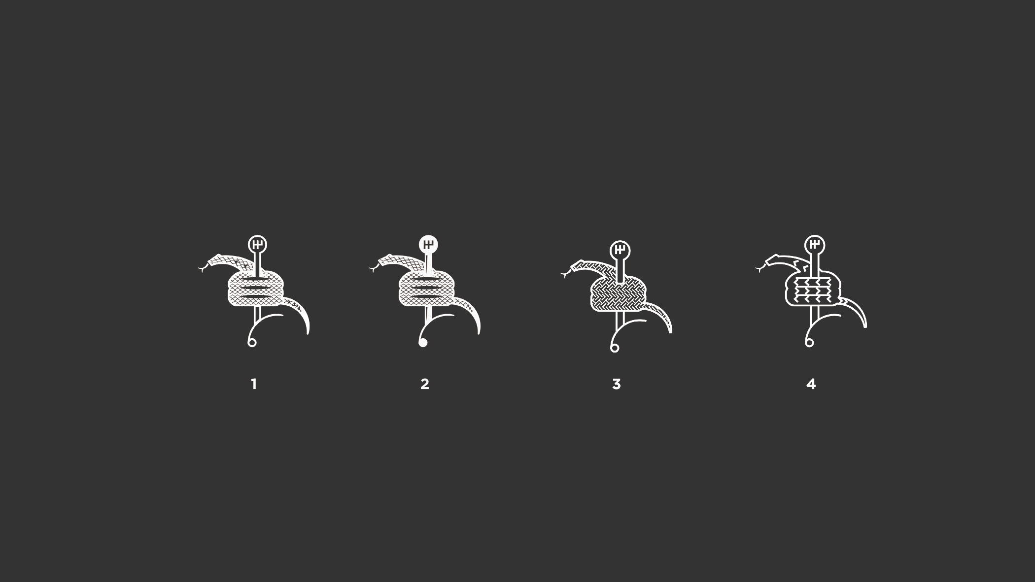
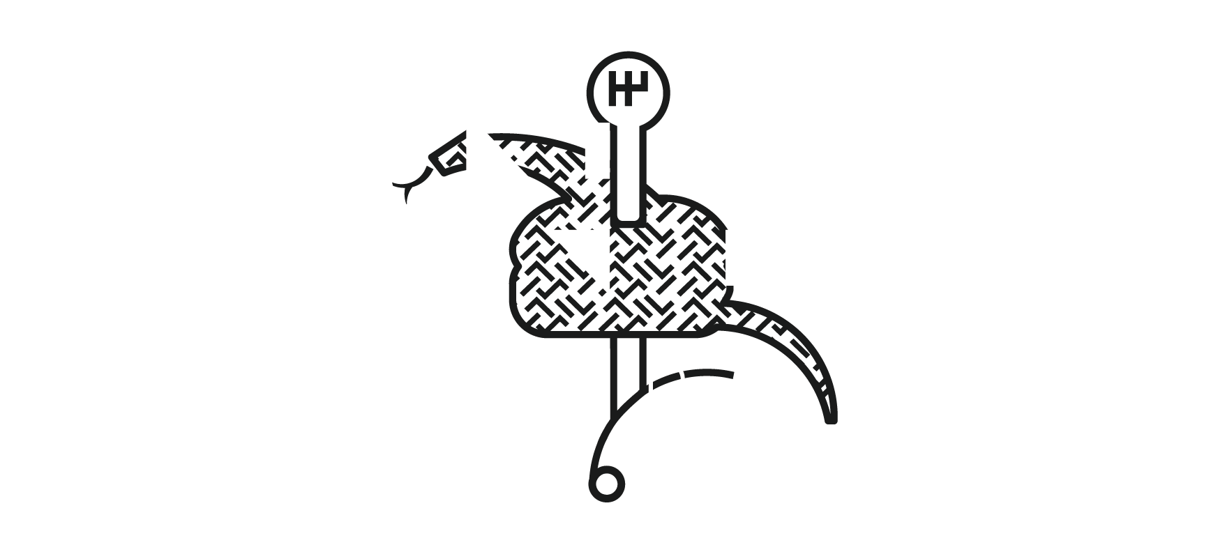
One of the early iterations of proposed logotype also included a sketch of a snake made out of tire tread with the tag line “tread wherever the fuck you want.” I just couldn’t shake how funny I thought that was, so in the end, we decided to use the primary wordmark (with a knockout of the “anti” icon in the “O”) and lay it over the snake for the full lockup.
![]()
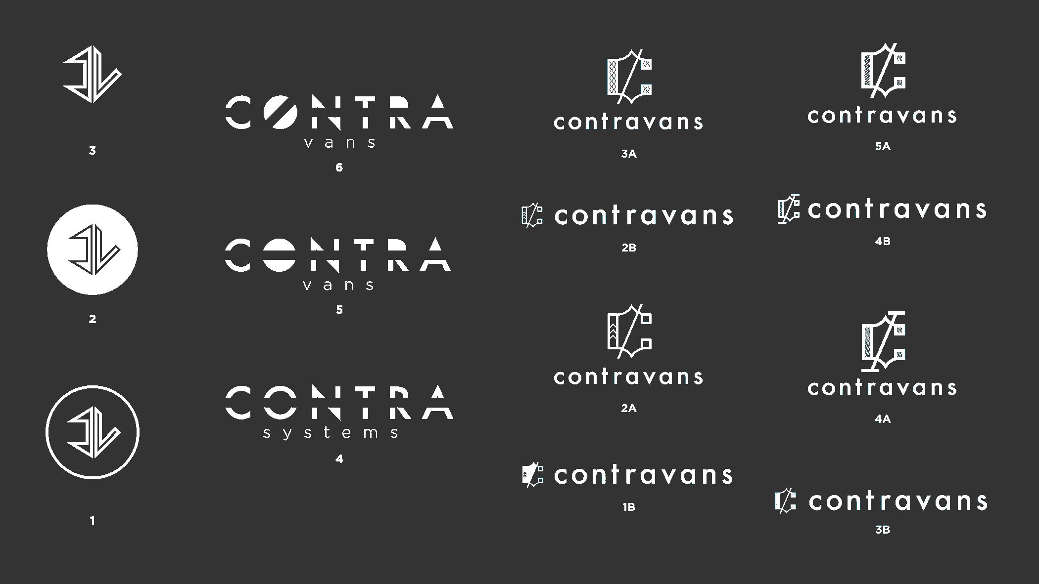
Strukture
These are from the third mock-up packet Contravans received.
Volumes I-III
Volumes IV-VI
Volumes I-V (A/B)
Symbol: CV in a stylized, geometric feeling
Wordmark: Includes knockout of “anti” icon in “O” – we ended up choosing this
Monogram: We were investigating a black letter approach